Case Study: Wayfinding (Oct 2021 - Feb 2022)
My role
Senior UX Content Designer
The problem
Baseline testing led by experience research showed that users were struggling to find Mailchimp’s store and appointment products. (E.g. The task “Locate where you’d go to create a store” had an unfortunate 8% pass rate.)
Testing also showed that once users were able to find these products, they also struggled with day-to-day management and task completion.
I teamed up with a fellow UX content strategist (Kory), a product designer (Alicia), and an experience researcher (Aylor) to develop a recommendation and test it with a hybrid baseline-usability test.
Users were unable to locate where to set up an online store or online appointments.
The initial sub-navigation, which caused confusion for users who asked “Isn’t my website my store?”
Phase 1: The Messy Miro
My colleague Kory (UX content strategist) and I began by layering the existing baseline research findings over a customer experience (CX) flow of the stores and appointments experiences to highlight problem areas and begin to note the themes we saw.
A window into our CX flow, which layered research findings over the current experience.
We noticed that the way our products were surfaced in the navigation did not match up with our users’ mental models, causing a lot of wayfinding frustration.
Phase 2: Thesis and initial recommendation
After summarizing our themes and problem statement, we arrived at our thesis statement/goal of our recommendation:
Create an experience for our customers that is consistent with their mental model and surfaces tasks in a way that’s tailored to their unique needs.
Using our thesis as a guide, we worked through different hypotheses for how to address wayfinding issues.
Should we rename primary nav items?
Create brand new primary nav items?
Unify duplicative experiences?
We documented pros, risks, dependencies, and gaps in each hypothesis. We used feedback from product and content design leadership as well as our IA governance team to develop our initial recommendation.
A window into our brainstorming Miro. Two approaches, with pros and risks for each.
We landed on a three-part recommendation, which included:
Updating the nav label from Websites to Website & Commerce
Reorganizing the subnavigation around jobs to be done (vs. product names)
Combining multiple, duplicative dashboards into a single dashboard
Outputs:
The messy Miro showing our work
Deck for presenting our recommendation stakeholders
Phase 3: Prototype and test
With the green light from IA governance to move into testing, we met with experience research to determine the best test approach, and settled on a hybrid usability and benchmark test. That way we would be able to see improvements or losses in the task rate success from the previous baseline test.
Next, we shared our content and interaction models with a product designer to develop a prototype for testing. Since we were testing our content design recommendation, we decided to keep the design at the lower fidelity (greyscale, fewer images).
We created an unmoderated test in usertesting.com with 6 participants who sell products online and 6 participants who offer services online to validate/invalidate our recommendation for both parties.
From our lo-fi prototype: A new empty state for easier wayfinding
From our lo-fo prototype: A new active state for easier management and wayfinding.
Outputs included:
Figma prototype
Phase 4: Synth and final recommendation
We devoted an entire day to watching user testing videos and taking notes, then spent time synthesizing our findings. The test results were overwhelmingly positive, showing a 42% increase over baseline task pass rates for wayfinding.
From our researcher: “For this type of hybrid usability/benchmark study, we don’t focus too much on the numbers. Instead, we can use them as a guide to help us uncover problems in the design, discover areas for improvement, and learn the behavior and preferences of our target users.”
We then used these to craft our final recommendation, which we shared with our product partners. The update has not yet been implemented.
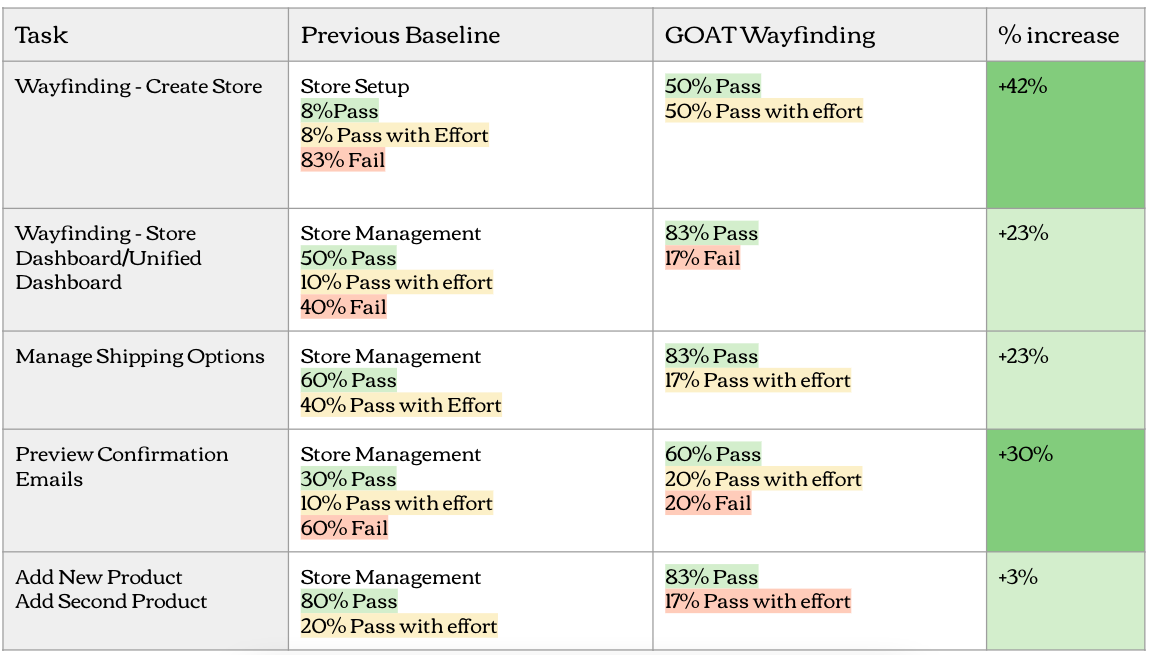
A snapshot from the results of our test, compared to the original baseline test results.
Outputs:
One-sheet for product leadership
Deck for cross-functional sharing
Case study deck for content design peers
Learnings & takeaways
Stick to a project plan. This project took place outside of day-to-day squad work over a period of ~6 months. To keep it rolling without hard deadlines, our Senior Manager of Content Design instituted a methodical approach with clear milestones. This way of working helped us retain momentum and deliver a recommendation in a timely fashion.
Removing dependencies. While creating our prototype, our team began to get sidetracked by trying to accommodate upcoming work. We had to zoom out and ask ourselves: if we had to deliver a recommendation tomorrow, how would it work? This helped us center in on our problem statement and remove the noisiness of other work and dependencies.
Create a prototype that matches the recommendation you’re testing. In our case, we were testing a content design recommendation, so we opted to keep the prototype lo-fi and remove images. This helped us focus on the content recommendations we wanted to test.
Use your test to validate AND invalidate your recommendation. In addition to testing tasks that scored very low on initial benchmark testing, we also decided to test tasks that had 100% pass rates to ensure that our recommendation did not create any new/additional problems.
Feedback
“This is such an example of everyone doing everything really well. The research was great, the approach and the consideration of the user mental models was actually really in depth. I just want to hold this up as an example of what this kind of work should look like.”
—Staff Experience Researcher, Carrie H.
“This is a good case study and what thoughtful problem solving looks like.”
—Senior Manager, Content Design, Ben M.